Home screen
How to set up a minimal Android home screen
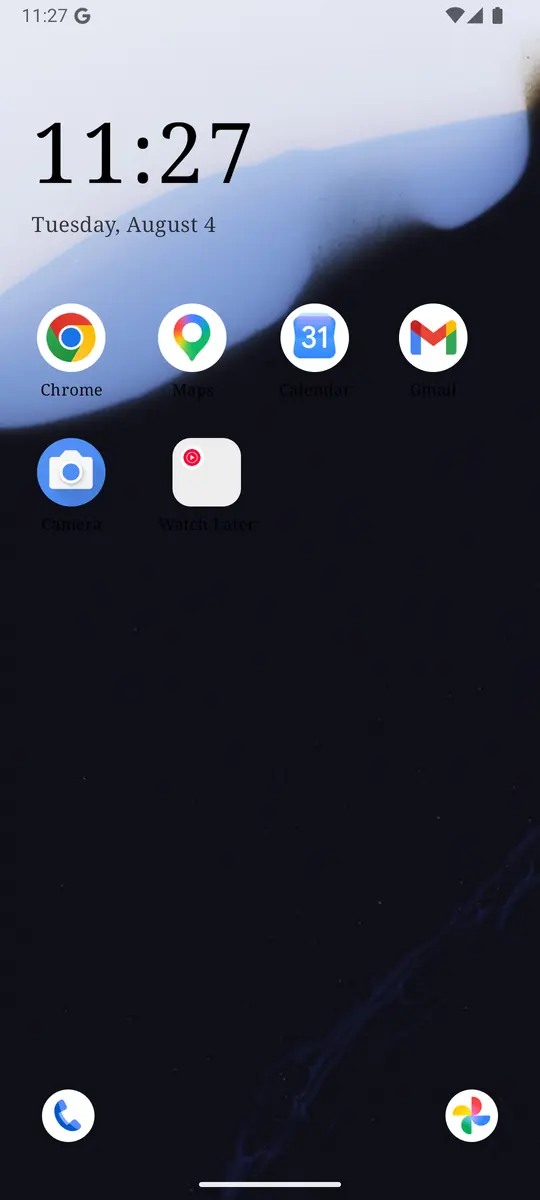
A minimal Android home screen shows a clock, the few apps you actually intend to open, and nothing that invites a scroll. Everything else stays one swipe away as a name in a list, so an app you are looking for is easy to find and an app you were not thinking about gets no free advertisement. You get that by replacing the launcher. You do not have to uninstall anything.
What belongs on the first page
The first page of an Android phone is a menu you look at dozens of times a day, usually for a reason that takes two seconds: the time, a message, a map, the camera. Default launchers fill that glance with suggestions, badges, news, and a grid of every icon the Play Store has ever handed you. Each icon is a small request. A minimal home screen declines the requests you did not make.
Three things earn a place.
- A clock large enough to answer “what time is it” by itself. If checking the time requires opening anything, the time check becomes a session.
- Apps you would be glad to have opened. Messages you answer, maps, a notes app, a calendar, the tool you sat down to use. Full-color icons are fine here. Color on an app you chose is a label. Color on an app the launcher suggested is an ad.
- A way to reach everything else that does not show it off. A second page of names, alphabetical, with search. Reachable in one gesture. Invisible until you ask.
That is the whole layout. Themes can change type and color. They should not change this structure, or the minimal version quietly grows widgets back. ReClaim follows that rule: themes touch color, type, and the wallpaper, and the layout stays a clock, your picks, and a list. The reasoning is the same one on our approach page. The home screen has one job.
Set it up
ReClaim is the launcher we build, so these steps are the ones we can describe exactly. The same shape works if you are willing to maintain it by hand on another home app: few icons, no suggestion row, a drawer you can search. The maintenance is the part that usually slips. A launcher that refuses to put icons back is the part worth having.
- Set ReClaim as your Home app. Install it and accept Android’s prompt, or set it under Settings, Apps, Default apps, Home app. You can switch back on that same screen. The phone’s other apps keep working. Android 8.0 or newer is the floor, and nothing about this layout needs root. The rest of the requirements are listed on system requirements.
- Leave the clock on. It sits above the apps with the date under it. You can change the face, 12-hour or 24-hour time, and the date format. Turn the clock off only if something outside the phone already answers the time question for you.
- Add the apps you mean to open. Long-press an app and add it to the home screen. Put them in an order you can remember with your eyes closed. If a spot needs a justification longer than one short sentence, it does not get a spot.
- Set the corner shortcuts. Bottom left starts as the phone dialer. Bottom right starts as your gallery. Long-press either one to point it somewhere else. These are for actions you take with the phone as a tool: call, photograph, maybe a notes app. They are a bad place for a feed.
- Swipe to the list and confirm the noisy apps are only there. Names, alphabetical order, folders you made sitting above the letters. If a distracting app is still on page one, move it now, before you get used to the new screen.
- Set the gestures once. Defaults are below. Change them to match what you already do, then stop visiting the gesture screen.
The layout needs no extra permissions. Usage Access and the Accessibility service show up only when you add limits or system-wide closing, which is a later layer. You can live on the quiet home screen with both of those off. How it works on the main site is the short version of this list.
What to leave off
Minimal fails in the decorations people add because each one seemed small.
- Suggested apps and “people also open” rows. Those rows are trained by whatever you did last, which is often the thing you are trying to do less of. A suggestion row puts that thing back on page one every morning.
- News, weather-plus-headlines, and social widgets. A widget that updates is a checking target. The weather by itself can be a reasonable widget. The weather stapled to a headline stack is a feed with a temperature on it.
- Unread badges on anything you open out of anxiety. A red dot is a task the app assigned you. Mail you intend to answer can keep a badge. A social app’s badge is the app reaching onto your first page.
- Folders full of “maybe.” A folder of six colorful icons is six cues with a lid. If you open the folder to hunt, the hunt is the session. Let those apps live in the alphabetical list.
- A second and third home page of icons. Extra pages feel empty and responsible. They are still a museum of cues you swipe past on the way to the clock. One page is the point.
Wallpaper is fine. A photo, a plain color, something calm. It sits behind the clock and does not ask for a tap. What it should not contain is text you have to read, because text you have to read is another check.
The list for everything else
The fear behind a minimal home screen is that you will not be able to find anything. The fix is a list that is boring and fast, not a list that is hidden. ReClaim’s second page is black text on a plain background, alphabetical, with a letter index down the side so you can jump. Search is at the top. A folder you created, if you have one, sits above the alphabet, because you grouped those apps on purpose and they should not be scattered into the letters.
There are no icons in that list. We tried the obvious version, a normal drawer with smaller icons, and it had the same problem as the home screen at a lower volume: you go in for one name and leave having noticed three others. A name is enough when you already know what you opened the list to find. If you do not know the name, you do not have an errand, you have a browse, and the list is allowed to be bad at browsing.
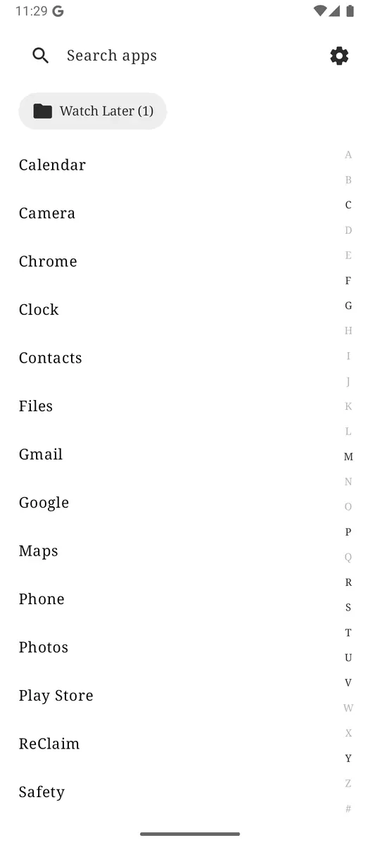
Search from the list is for apps. The separate swipe-up gesture defaults to web search, which is a different job: something on the internet, not an icon you misplaced. Keeping those apart means “where is the train app” does not dump you into a browser results page, and “what time does it close” does not dump you into your app grid.
The clock and the two shortcuts
Most unnecessary unlocks start as a time check that the lock screen did not quite satisfy, or as “I should take a picture of this” that becomes a tour of the home page on the way to the camera. The clock answers the first one without a tap. The corner shortcuts answer the second, if you point them at the actions that are actually tools.
Phone on the left and Photos on the right are the defaults because those two survive almost every “what do I genuinely use a phone for” list. If your real pair is different, a transit app and a notes app, a flashlight and the camera, change them and leave them. A shortcut you swap every few days is another decision. The home screen is trying to retire decisions, not host them.
Favorites in the middle should be just as stable. Reorder them until your hand knows the spot, then stop. An app that migrates between the home screen and the list every other day is an app you have not decided about. Decide. Home screen, list, or, if the indecision is really “I open this and wish I had not,” one of the tools in the next section.
Gestures that stay out of the way
From the home screen, three gestures are available, and each one can be reassigned or turned off:
- Swipe up defaults to web search.
- Swipe down defaults to notifications.
- Double-tap defaults to the camera.
The other options are app search, the clock, a simple task list, or nothing. Nothing is a respectable setting. A gesture you never remember is a gesture that sometimes opens a surprise, and surprise is how you end up in the wrong app. Pick the three actions you already reach for, assign them, and let muscle memory take over. Notifications on swipe down matches what a lot of phones already taught your thumb. Camera on a double-tap means a photo does not require finding an icon between other icons.
Gestures are a poor place to hide your distracting apps as a “secret” opening method. You will learn the secret. The list is the honest place for those apps, with friction added only where you have asked for it.
When a quiet page is not enough
A minimal home screen removes a cue. It does not remove the app. If you swipe to the list and tap the name on purpose, the app opens, which is what should happen when you had a reason. If you swipe to the list and tap the name the way you used to tap the icon, the page did its job and the habit walked around it. That is the moment for a second layer, chosen to match what is actually going wrong.
- You open it before you have decided to. Hide it, with a challenge that takes a few seconds. The levels and the defaults are in how to stop opening apps on autopilot.
- You open it on purpose and then lose the afternoon. A daily or weekly limit, or a reminder that asks for a number of minutes first. The choice between those is limits versus blocking versus reminders.
- You do not want it available until a time you can name. Block it for that duration. A manual block runs until the time is up.
Add one of those, for one app, after the home screen has been quiet for a few days. Starting with all of them on night one makes the phone feel like a project, and projects get abandoned for the old launcher. The old launcher is one settings screen away, which is a good thing. You should be able to leave. A setup you stay with is the one that got lighter, not the one that got more elaborate.
Common setup snags, if blocking or limits seem to snore in the background later, are collected on the support page. They are almost always System-wide blocking or a manufacturer battery saver, and they have nothing to do with how the first page looks.
A check after the first week
Look at the home screen on day seven and ask one question of each icon: did I open this on purpose this week? An icon you did not open can leave. It is still in the list. An icon you opened mostly when you were bored is the one to move, even if you like the app. Liking it is how it earned the spot. Boredom is how it keeps the spot.
Then look at the list for the name you typed into search over and over. That app is a candidate for the home screen. Search history, even the informal kind you can feel, is a better designer than a grid you inherited. Promote one app. Demote one app. Stop.
If the week felt calmer and you cannot point at a feature that “worked,” the quiet page is the feature. Checking the time stayed a time check. The apps you meant to use were where your hand expected them. That is the result. It will not show up in a screen-time chart as a dramatic number, and it does not need to. We do not promise a specific drop in hours. We promise a first page that stops arguing with you. The rest of the phone is still there when you go looking for it.
Clock on. Four to six apps you would defend out loud. Phone and camera, or whatever your real pair is, in the corners. No badges, no news, no second page of icons. Everything else is a name, one swipe away. Revisit in a week and move exactly one app.
Questions
Do I have to uninstall apps to get a minimal Android home screen?
A minimal home screen is a choice about what the first page shows. Every other app can stay installed and one swipe away, as a name in a list.
Can I go back to my old launcher?
Yes. Android Settings, Apps, Default apps, Home app. Changing it takes a few seconds and does not delete ReClaim or its settings. The FAQ covers the rest of the setup questions.
Will a quiet home screen stop me opening distracting apps?
It removes the cue from the first page. The app is still in the list. If you open it anyway, add a hide, a reminder, a daily limit, or a block. The home screen is the first layer, not the only one.
Does the minimal layout need extra permissions?
The clock, the home screen apps, and the plain list work without Usage Access or the Accessibility service. Those permissions matter only for limits and for closing apps system-wide. See requirements.